Aura Align
Brand identity – Packaging – Marketing
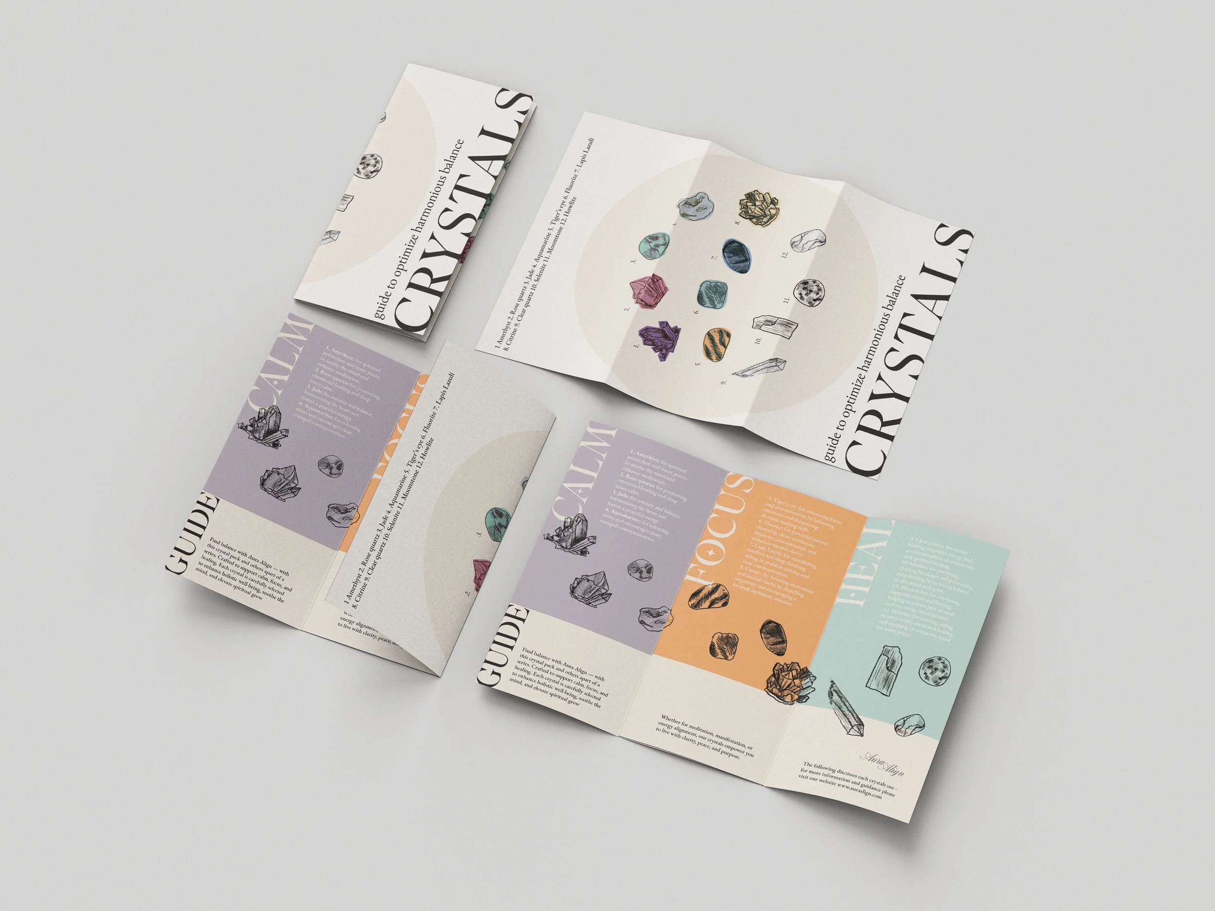
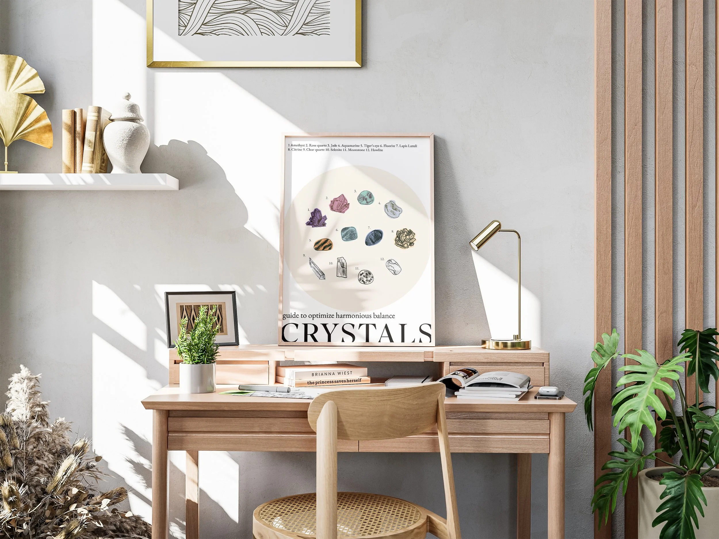
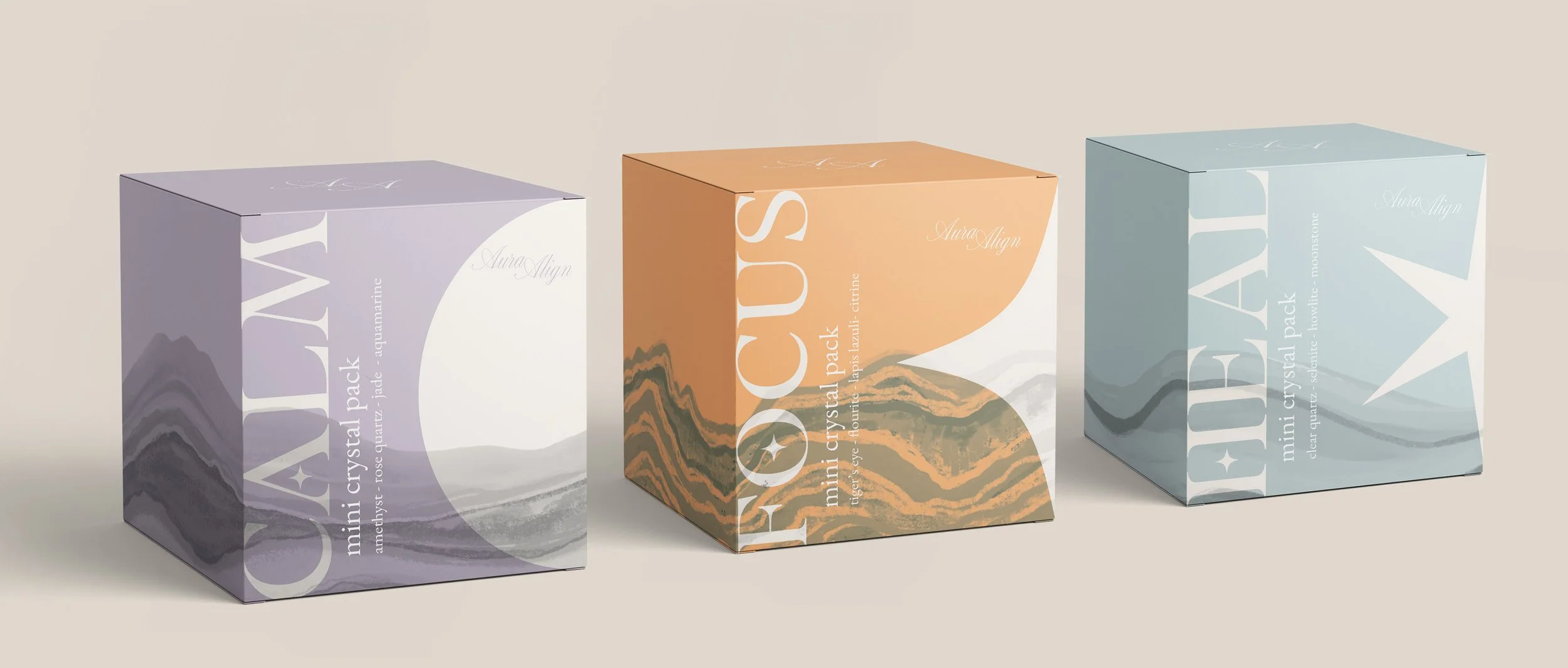
Aura Align Crystal Packs
This project showcases a packaging series for the spiritual wellness brand Aura Align. Presenting the launch of a new ethically sourced Crystal Packs, this series consists of three product variants designed to support overall health, targeting wellness–focused and design-conscious consumers.
The aim was to create a cohesive brand identity across touch points using colour and graphic variation, production print techniques and preparing assets for commercial print. With a focus on spirituality, premium product and sustainability, the use of minimal layouts, calming colour palettes, elegant typography and symbolic illustrations to reflect a dreamy and mindful aesthetic.
Challenge
Create a unique brand identity within a chosen market that utilises packaging and branding design principles to stand out on sleeves, and use print production techniques creatively while adhering to dieline and technical specifications.